Color may impact emotions and even behavior. Here’s how to use color in your spa to enhance your guest experience.
Just like the music and sounds guests experience in your spa or wellness business environment, color may have a dramatic impact on mood and emotion, and even influence customer behavior.
Studies have found that green may increase concentration and task accuracy and also that workers in white and predominantly blue-green offices reported higher perceived job performance and satisfaction than those in predominantly red offices.
Red, meanwhile, has been correlated with impaired performance on achievement of certain tasks, which researchers suggested is because red is associated with the danger of failure and evokes avoidance motivation. However, with sports, red outfits have been associated with an advantage over blue outfits.
This doesn’t mean that effects of color are universal. Multiple factors may influence how a person feels when exposed to a certain color, such as cultural or personal association. As pointed out here by Cameron Chapman, author of the book Colour for Web Design, “If a person’s favorite stuffed animal as a child was blue, for example, then they may have a preference for blue throughout their life. Or, at the opposite end of the spectrum, if they were hit by a blue car as a child, they might have a strong negative emotional reaction to the color blue.”
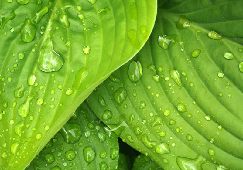
There are, however, universal human experiences that allow us to guess how people are going to react to some colors. Green and blue, for example, are associated with nature and calm, like plants, grass, forests, the sky, and water.
Chapman also notes the following associations:
Red is associated with passion, love, lust, rage, and warnings. She states, “Red can have a physiological impact on people, too, including raising respiration and heart rate.”
Orange is energetic, positive, and also connected with change due to its association with autumn leaves and seasonal transitions and, to a lesser degree, warnings.
Yellow is considered the happiest color and is closely associated with sunshine and hope, though it can also be linked with caution and cowardice.

When it comes to your spa environment, you might consider different colors for different areas, depending on the emotions and behaviors each is designed to evoke. You want your treatment and service areas to create feelings of calm and relaxation. You want the same of your staff break room, but you probably also want that area to feel energizing and rejuvenating, while you may want your retail areas to suggest a desire to purchase. Can colors help create the right atmosphere? We spoke with Leatrice Eiseman, a color specialist, head of the Eiseman Center for Color Information and Training and executive director of the Pantone Color Institute. Eiseman, also known as “the international color guru,” offered some insight on how to proceed when choosing colors for different areas of your spa.
Colors for your treatment rooms
“Color temperature is something that people are very aware of, even though it might be subliminal and not an obvious effect,” Eiseman said. “A natural selection for a spa could come from one of two directions. One would be the so-called cooler tones but with a little bit of warmth, blues and blue greens, like water and the sky on a beautiful day. These are colors that the human mind attaches to quiet, soft repose. Avoid electric blue or blues that lean towards the purple side, which is getting a bit too warm, though you could do a lavender. You want it to be welcoming and quieting, and to use colors that psychologically and emotionally affect people in a way that makes them feel sort of tranquilized. It can be a lighter tone or something more aqua, anything that has that watery or sky feeling that says it’s going to be a beautiful day.”
More heated colors, like yellows, oranges, or reds will have the opposite effect of what you want, she said.
“The other direction one could take is to use the pastel range in somewhat warmer tones, because they have a nurturing quality. You could do a very light peachy field. Pinks that lean to the warm side or the cool side, either one, are also quieting. Obviously, a lighter pastel range has a much quieter feeling than the brighter areas of color, provided they are kept soft and subtle and don’t start to heat up too much.”

Colors for your staff rooms
Eiseman said that, when it comes to staff break rooms, you want your team to feel energized, but you don’t want it to be aggressive because you also want people to feel relaxed and comfortable.
“You could do something more vital in either cool or warm tones, such as greens with more vitality. These are refreshing, which is a good word for anybody who is going to be working with others. You want the color to be a little more saturated and to have more brightness. I would avoid red. Red is the most exciting color but can be very aggressive and we don’t want that in a break room. I wouldn’t do the soft blue greens that I recommended for the spa, but something with a little bit more yellow base, to add a bit more excitement.”

Colors for your retail space
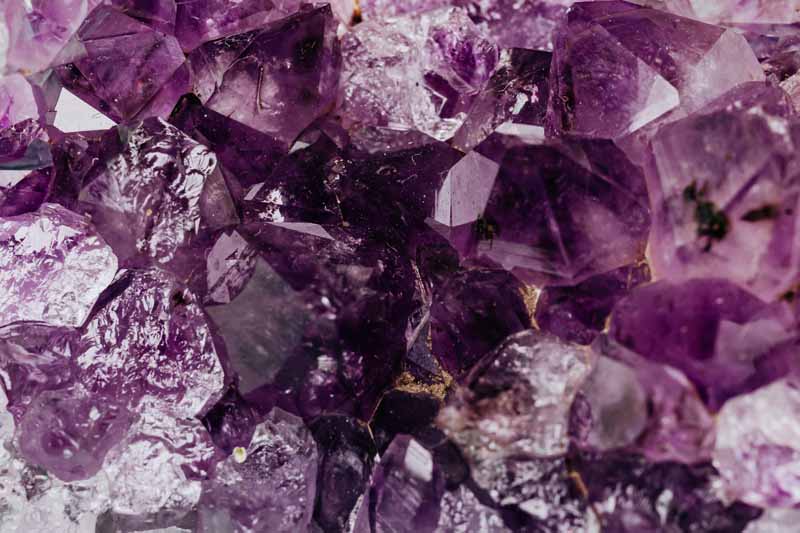
Eiseman said, “Retail is where you want to build up excitement. You want to make it very different from the rest of the experience. Red is still too aggressive. The purple family has quite a range, and purples can have an excitement attached to them because purple is a complex color made up of both red and blue, combining the best of all worlds. With high-end products I’d go into the purples that are a little deeper, like aubergine. That would make it very different from the other area and have a classy elegance attached to it that would be a great background for product.
Eiseman suggests that “one colored wall with product against it can be very effective, rather than all four purple walls, which would feel like it was closing in. Or it can be purple accents, like shelving.”
Another suggestion is the use of metallic colors in retail spaces, or something in the purple family with a metallic finish. Metallic colors, Eiseman said, add to the perceived value of the product.
All of this can work even if the waiting room is the same as the retail room, she said, “because when guests go into the spa area, they are really hit with the relaxation because of the difference in color atmosphere.”
We looked into our crystal ball and predicted the future for the year ahead. Subscribe to our newsletter and download our special report on the trends we’ll be watching: Nine spa and wellness trends for 2021. Download here.
Spa Executive is published by Book4Time, the leader in guest management, revenue and mobile solutions for the most exclusive spas, hotels, and resorts around the globe. Learn more at book4time.com.


